
HELPING SHOPIFY MERCHANTS RUN BETTER BUSINESS AND LIVE BETTER LIVES.
Branding Better Digital, Ecommerce, the better way!
Better Digital a NZ based Shopify and Shopify Plus digital consultancy. Guiding ecommerce owners, bridging the digital divide educating with a practical and systemised approach to growth. Follow the flags to a better digital experience.
Client: Better Digital, Gisborne New Zealand | Brand Strategy | Brand Identity Design
-
Damian a seasoned web developer with a wealth of experience in transforming ecommerce experiences through Shopify. Understanding the value in branding, it was time to invest into the Better Digital brand and build an eye catching identity that could take the business worldwide.
One of the challenges was positioning the brand within a relatively saturated industry of “Shopify Experts” most of which were web designers with little understanding of custom web development, Shopify integrations and overall business growth strategies required for an ecommerce business.
Through a brand workshop we were able to develop a brand purpose, core values, the ideal customers, a clear view of the current market providing a clarity and a clear path on how to develop the brand persona and brand identity. We needed to build a brand identity that was going to be memorable, functional and had legs to build out marketing campaigns and collateral with future growth.
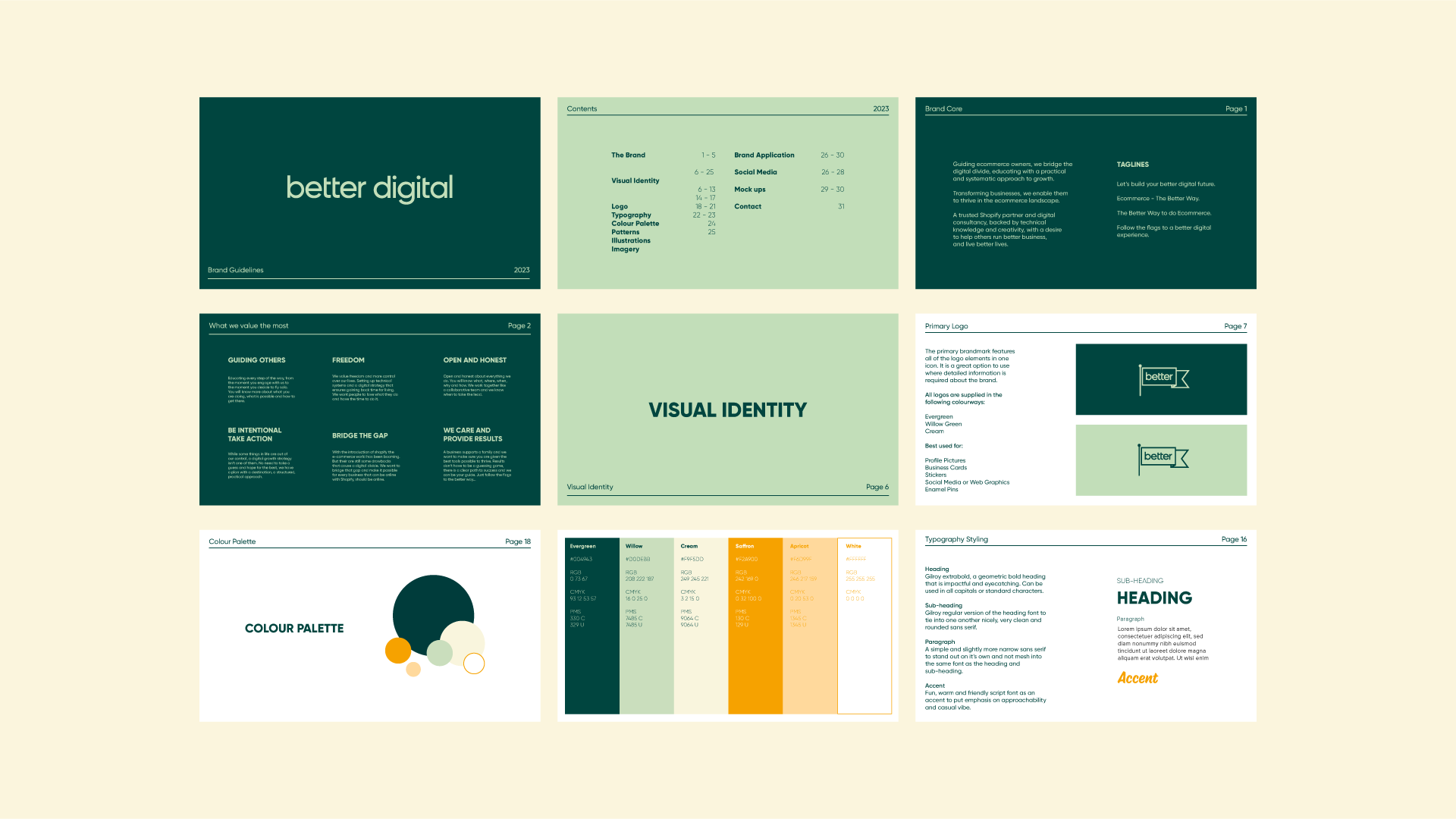
The Brandmark - Better Digital Flag
The flag represents the Better Digital values and business operations. Guiding others through a clear and structured path to their goals. It represents freedom, winning and growth. An icon to conquer big goals, like climbing a mountain or landing on the moon. Helping ecommerce owners set big goals, plant their flag and fly it high. We do ecommerce the better way, and lead our customers to victory.
The history and symbolism of a green flag was the perfect direction for Better Digital. A flag historically used to represent leaders and loyalty of a community now representing whole nations. Used to lead armies into battle and communicate with other ships at sea. A signal of ‘GO!’ The swallowtail shape used in maritime to represent the letter B.
Logo Variations
Having multiple logo variations was a must, building out different layouts of the wordmark and the brandmark flag in many different formats from small to large. The wordmark is calm, clean, simple and functional paired with the geometric structured flag that wasn’t overly ‘designed’. The designed needed to be straightforward, easy to understand and avoiding overly abstract concepts.


IT’S YOUR TURN