
Brand Identity Design for Dough Baby Bakery.
DELICIOUSLY NAUGHTY DOUGHNUTS!
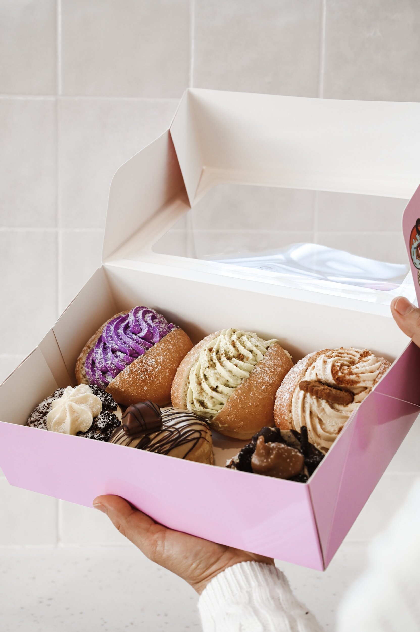
A doughnut and coffee shop in New York City serving stuffed to perfection, Instagram worthy doughnuts and luxury coffees.
Client: Dough Baby, New York City | Brand Identity Design | Brand Collateral | Packaging
-
The Logo
The logo needed to be bold to stand out in urban landscape and deliciously cheeky. Logo variations full of personality that can be used across digital and print applications, A simplified version of the logo wordmark was required for ink stamps and patterns. We built a brandmark out of the sans serif D and script B.
Colour
The colour palette builds on the brands feminine and bold personality. Light pink, dark pink, red and white was a contrasting palette that drives the brand values across all mediums.
Typography
The typography styling for this project makes the brand very versatile. We wanted to be able to bring in the logo fonts to other brand collateral. The typography is a perfect balance of a bold sans serif, script and a light weight sans serif.
Brand Elements
To bring this brand to life we needed to build out many different types of brand elements. A range of patterns that can be used on brand packaging and coffee cups, illustrations for stickers and social media. Artwork for the physical store and everything in between.
Brand Collateral
With the brand collateral we had to bring in the brand personality across the menus, packaging and staff uniforms. The cheekiness of the brand needed to be front and center and clever. e.g. on the single doughnut packaging we included a saying of “That realisation when you should’ve bought more than one doughnut…”


IT’S YOUR TURN